LearnShare set out to bridge the gap between specialized clinical knowledge and technical fields like surgical planning, 3D printing, and biomedical engineering. Their original learning management system was fragmented and lacked a clear structure for learning, sharing, and collaboration across diverse user types—from students to surgeons, engineers to instructors.
As the sole UX/UI designer on the project, I led the full platform redesign while at Urban Insight, shaping a user-centered vision that elevated both the experience and impact of learning.
LearnShare’s existing platform lacked the cohesion and clarity expected of a modern LMS. Users—including healthcare professionals and engineers—struggled to navigate courses, understand their learning progress, and find relevant resources or communities.
Challenges included:
Reimagine LearnShare as an inclusive, intuitive, and empowering learning platform that:
We approached the redesign by grounding every design decision in user needs, behavioral flows, and brand alignment.
Key actions included:
I was the sole UX/UI designer on the project, responsible for:
I worked closely with stakeholders, engineers, and product teams to ensure alignment and consistency throughout the entire redesign effort.
The redesigned LearnShare platform laid the groundwork for a flexible, scalable product that could support multiple user roles and learning models.
Results included:
Redesigning LearnShare required not just a fresh UI, but a deep rethinking of how learning flows, content structures, and user expectations align in a modern LMS. With a range of audiences—from surgeons to students—we needed to design an experience that balanced clarity, flexibility, and trust.
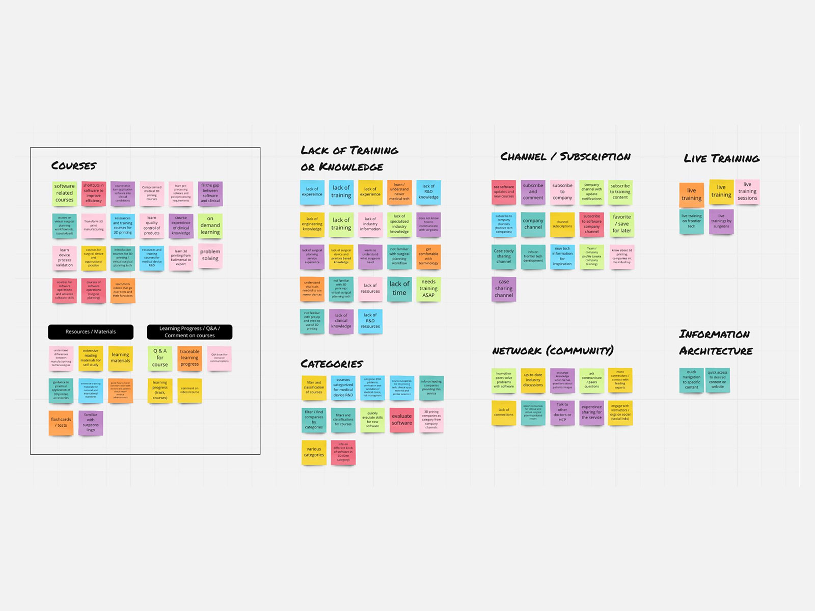
We kicked off with a full audit of the legacy platform and competitive benchmarking. I worked with stakeholders to uncover friction points for both learners and content creators. Key themes emerged: role confusion, inaccessible mobile layouts, and a lack of hierarchy between content types.
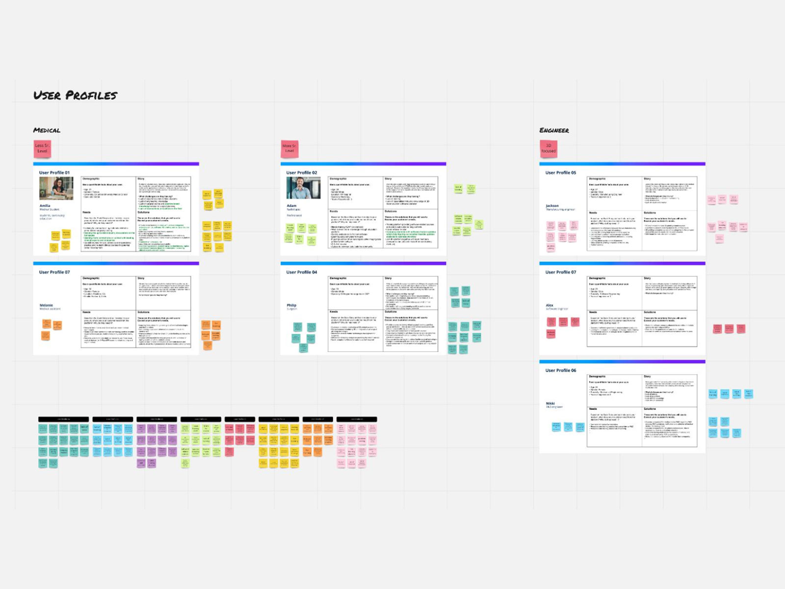
To design for clarity and inclusion, I created detailed personas and journey maps covering students, engineers, medical professionals, and instructors. This allowed us to define not just what each user needed to do—but how they needed to feel at each point in the journey: empowered, informed, and supported.
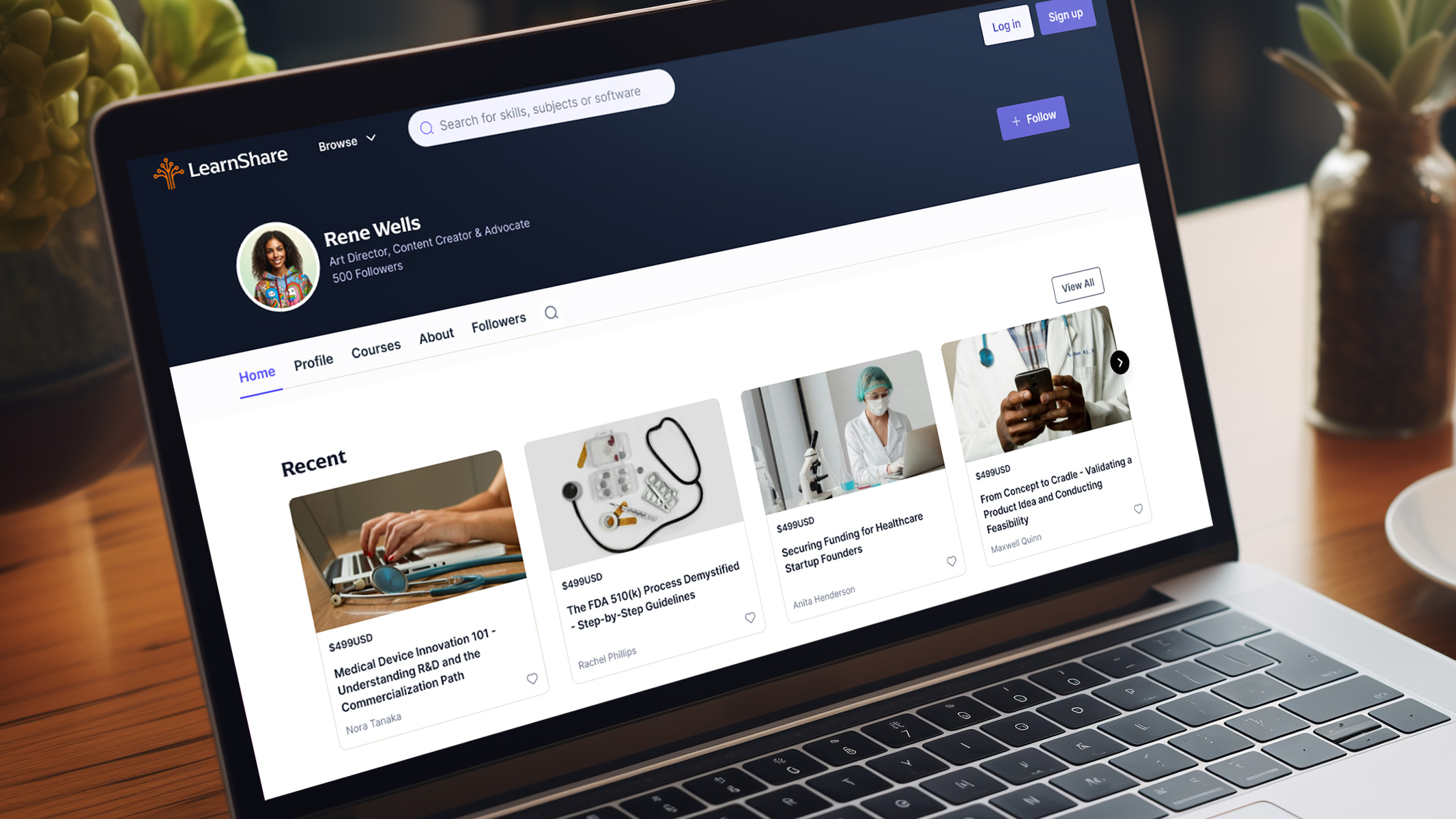
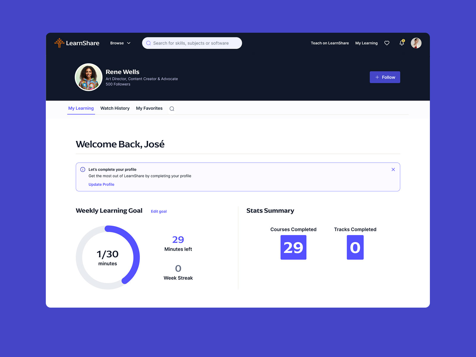
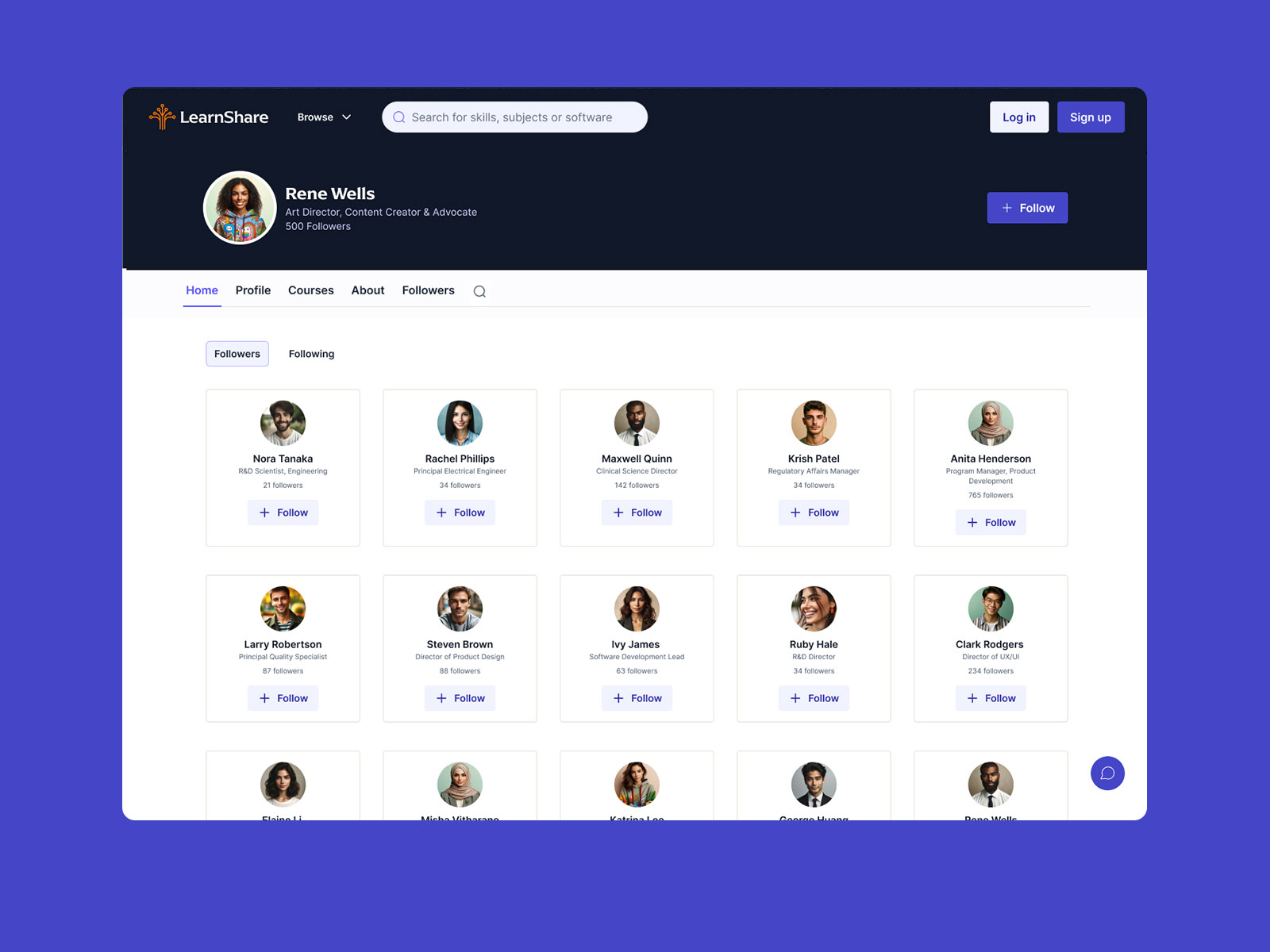
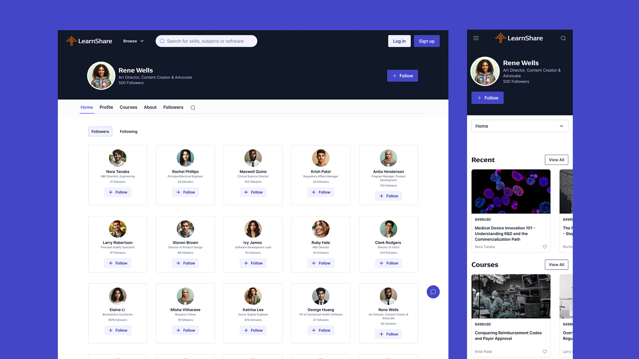
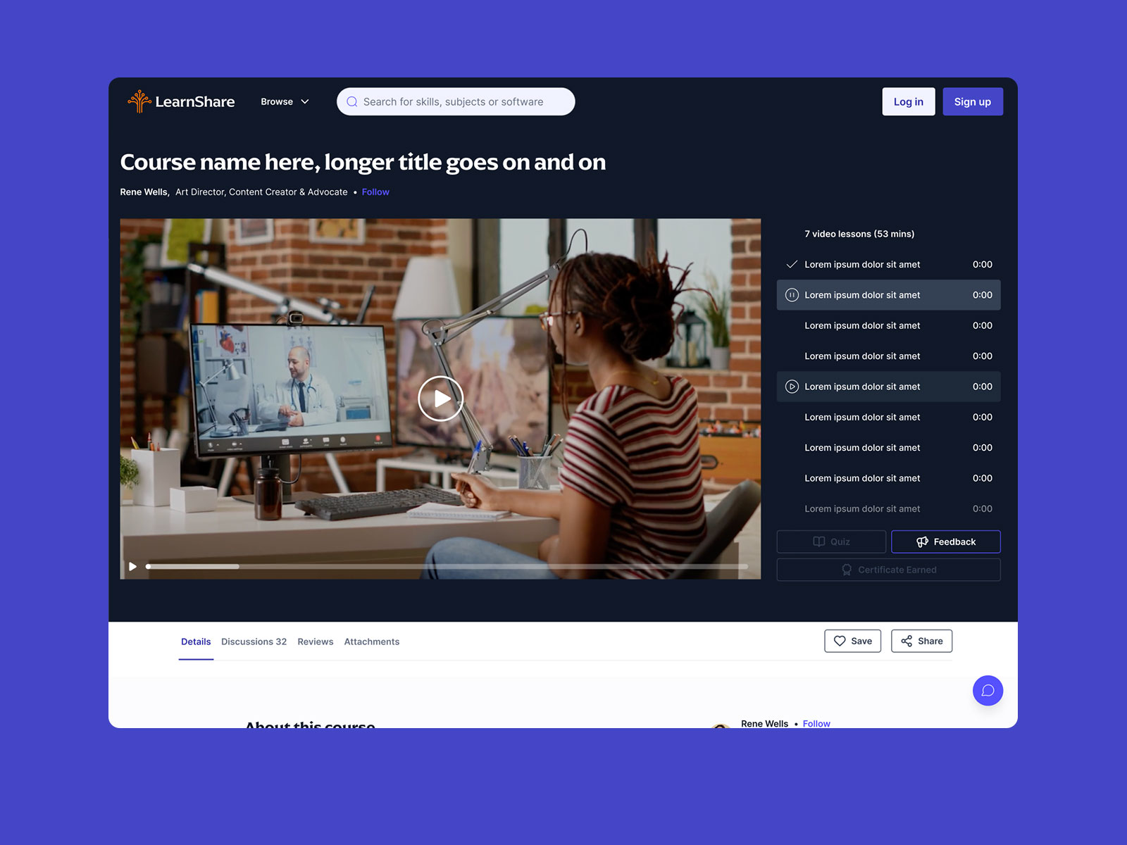
I developed a new site architecture centered on task completion and discovery. Users could find content by role, topic, or goal—with clearer category labeling, smart filtering, and progressive disclosure of detail.
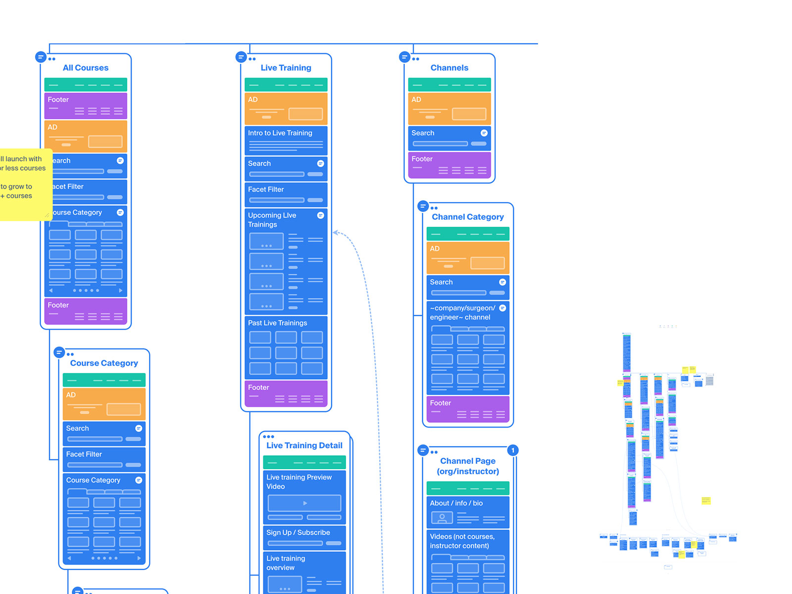
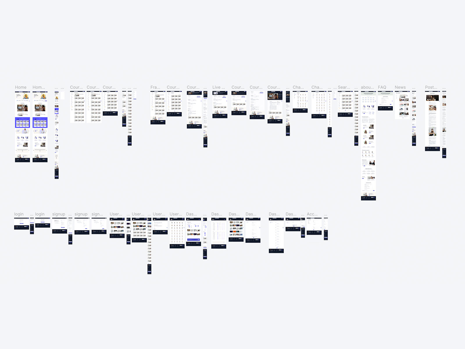
I translated our strategy into low-fidelity wireframes across all key flows: course discovery, channel pages, course playbacks, admin dashboards, and subscription management. We tested structure, hierarchy, and navigation models with internal stakeholders for feedback.

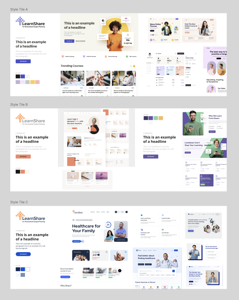
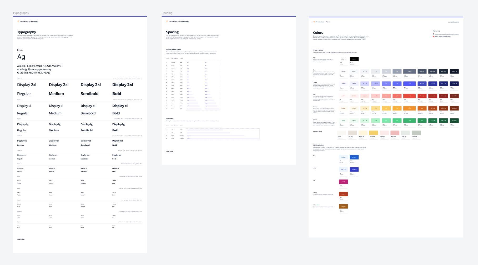
I designed a flexible UI system rooted in the brand's new tone: clean, warm, and professional. The system supported dark text on light backgrounds, generous spacing, and consistent states. Accessibility standards were embedded throughout—including color contrast, keyboard navigation, and alt text specs.
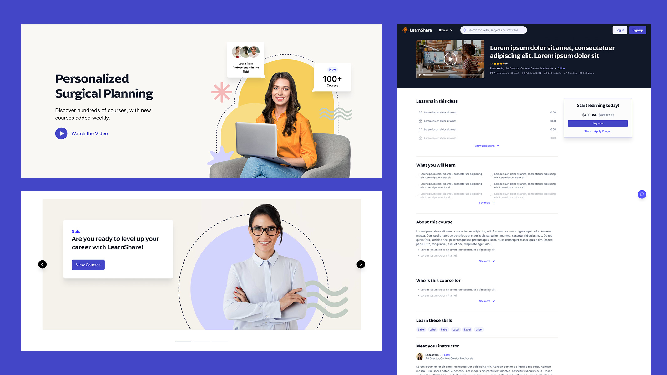
From wireframes, I moved into detailed design and prototyping—delivering a polished, scalable UI with support for mobile, tablet, and desktop views. Each interaction was tested and refined to reduce cognitive load and support trust-building across diverse audiences.
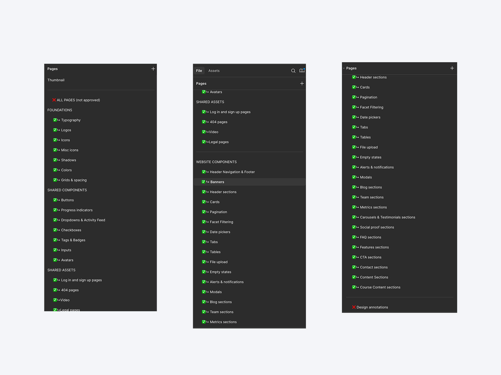
I prepared annotated design specs, built out modular component libraries, and worked closely with the development team to ensure fidelity through implementation. I supported QA by reviewing interactions, animations, and content formatting for consistency across all breakpoints.
LearnShare was a full-scope, ground-up redesign that demanded thoughtful systems thinking, inclusive design, and clear storytelling across a complex domain. From creating the brand voice to designing scalable components, I guided every detail to reflect real user needs.
The platform now speaks to both its mission and its users—supporting upskilling, collaboration, and access to specialized knowledge. It’s a testament to what’s possible when strategy, empathy, and execution align.


Informatica Next Gen Data Loader

Financial Risk Management Dashboard (Confidential)