Informatica, a leader in enterprise cloud data management, needed to reimagine its Data Loader—a core product used to extract, transform, and load data across systems. Rather than applying a new design system to the existing tool, the team was tasked with developing a next-generation concept from the ground up. This redesign would serve as a public-facing signal of innovation, unveiled at the Informatica conference, and set the direction for future product development.
As Senior Product Designer, I led UX and UI design for both the new dashboard and the next-gen Data Loader prototype, collaborating closely with product managers, engineers, and internal design stakeholders.
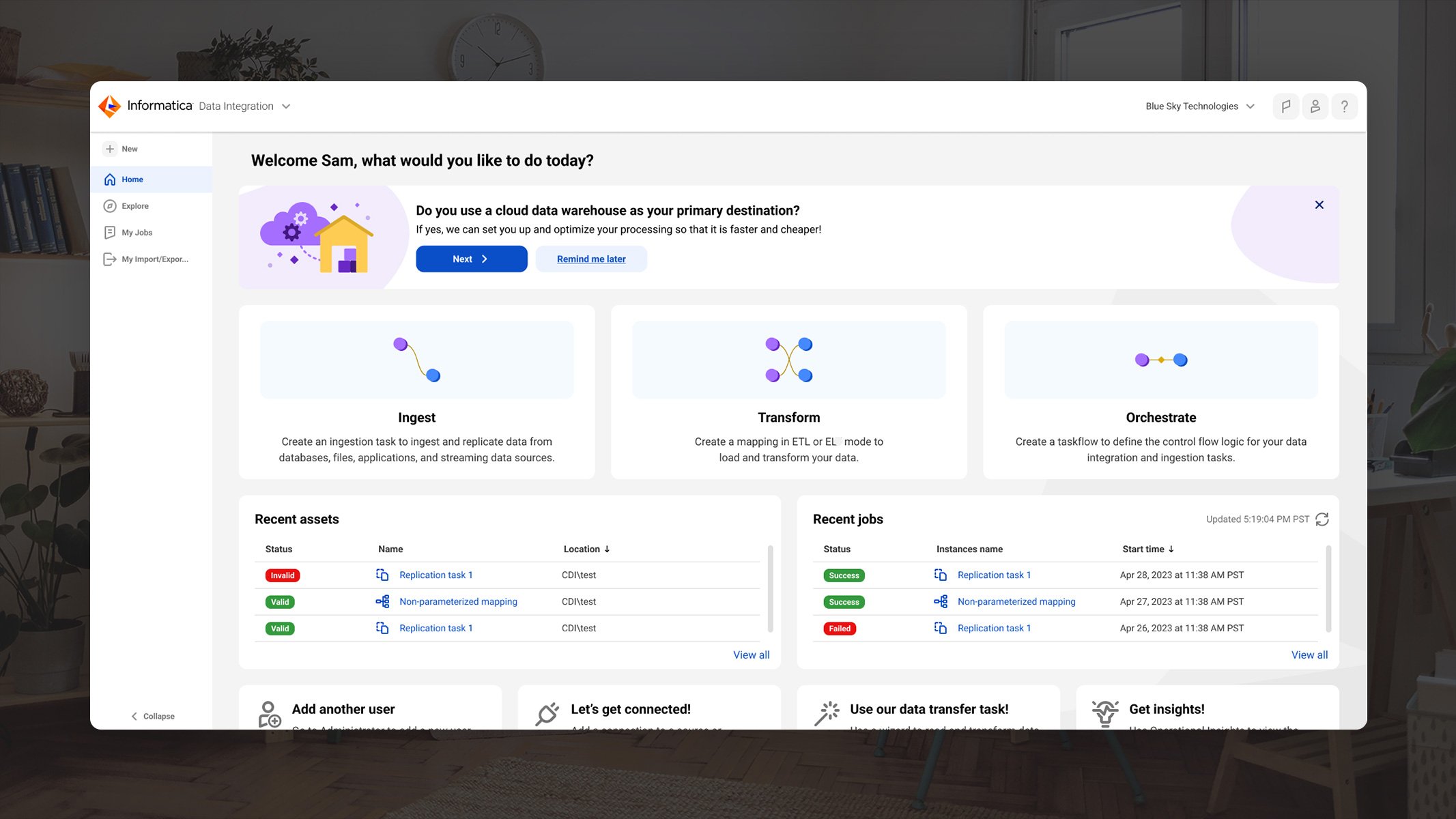
The legacy Data Loader product was dense, unintuitive, and overwhelming—particularly for new users unfamiliar with data engineering workflows. While power users could navigate the system, first-time users struggled to get started or understand key flows, leading to high drop-off and frustration.
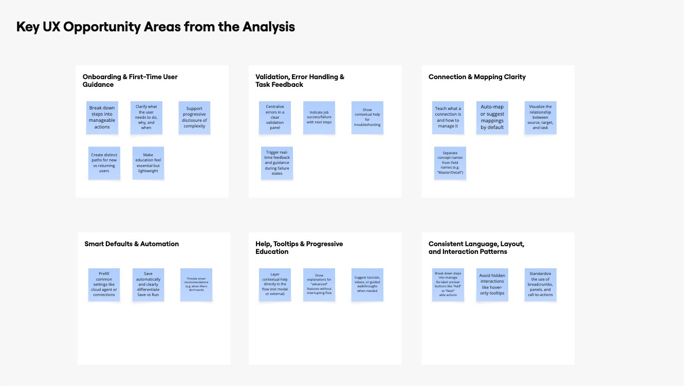
Key issues included:
To design a modern, intuitive, and scalable experience that simplifies entry for new users while supporting progressive complexity as user needs evolve. The solution would:
We approached the redesign with a focus on user-centered, progressive complexity:

As a team we audited the existing Data Loader dashboard and workflows to reveal opportunities to improve usability and reduce complexity.
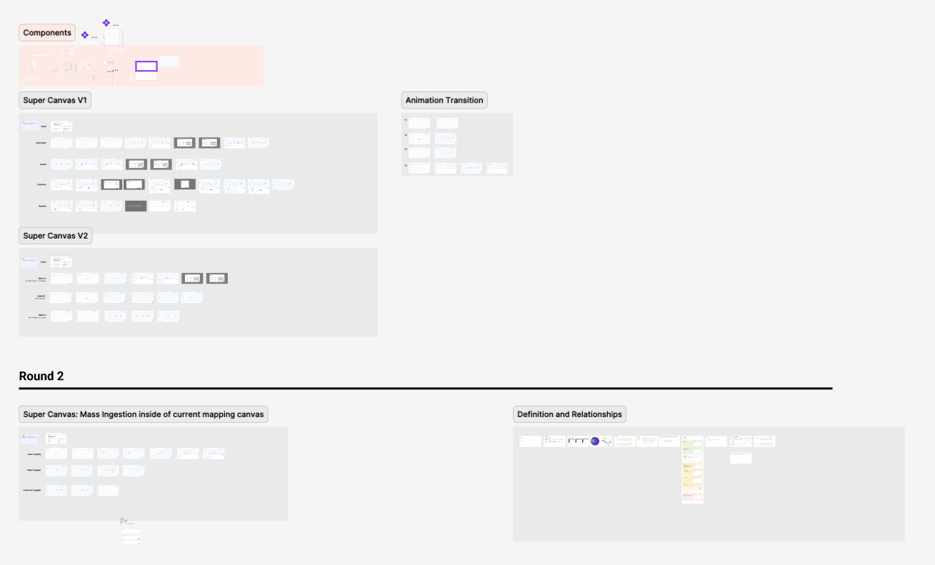
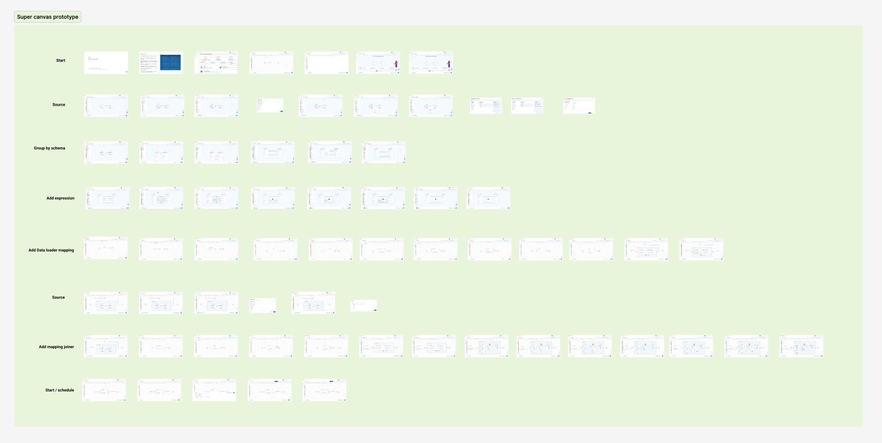
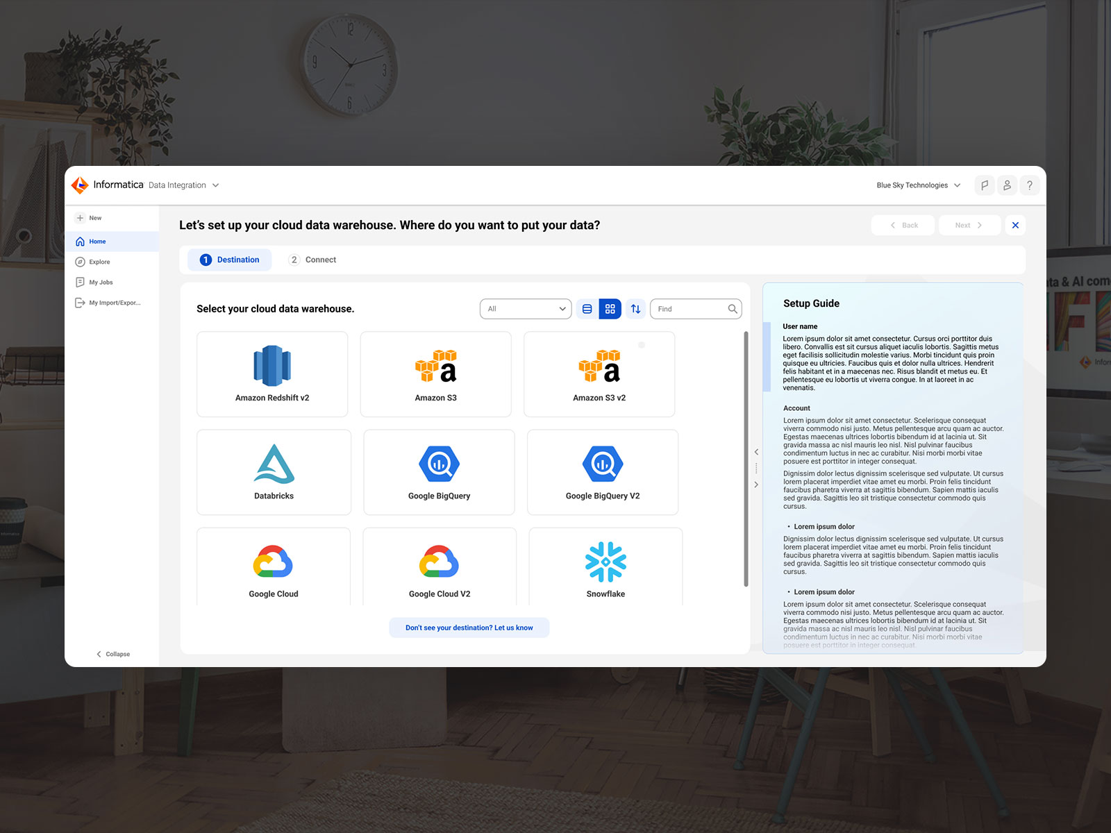
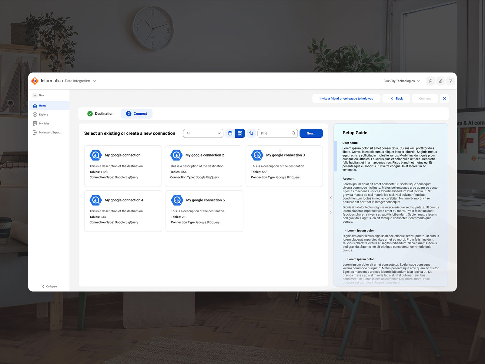
We wireframed and prototyped approaches focused on simplified data mapping and AI-powered recommendations. Integrating the latest Informatica Design System, we created new data loader components and contributed them back. An updated dashboard design emerged, balancing ease-of-use and flexibility.
Click-through prototypes were shared with stakeholders and refined based on excellent feedback. The final user flows, wireframes and interactive prototype modernized the interface for next-gen usability. Our human-centered process enhances the user experience for Informatica's data loader.
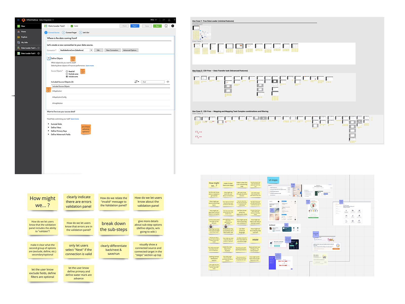
We began by auditing the legacy Data Loader to uncover usability issues and technical friction. Using annotated screenshots and stakeholder input, we identified pain points around validation, mapping logic, and unclear UI hierarchy—especially for first-time users.
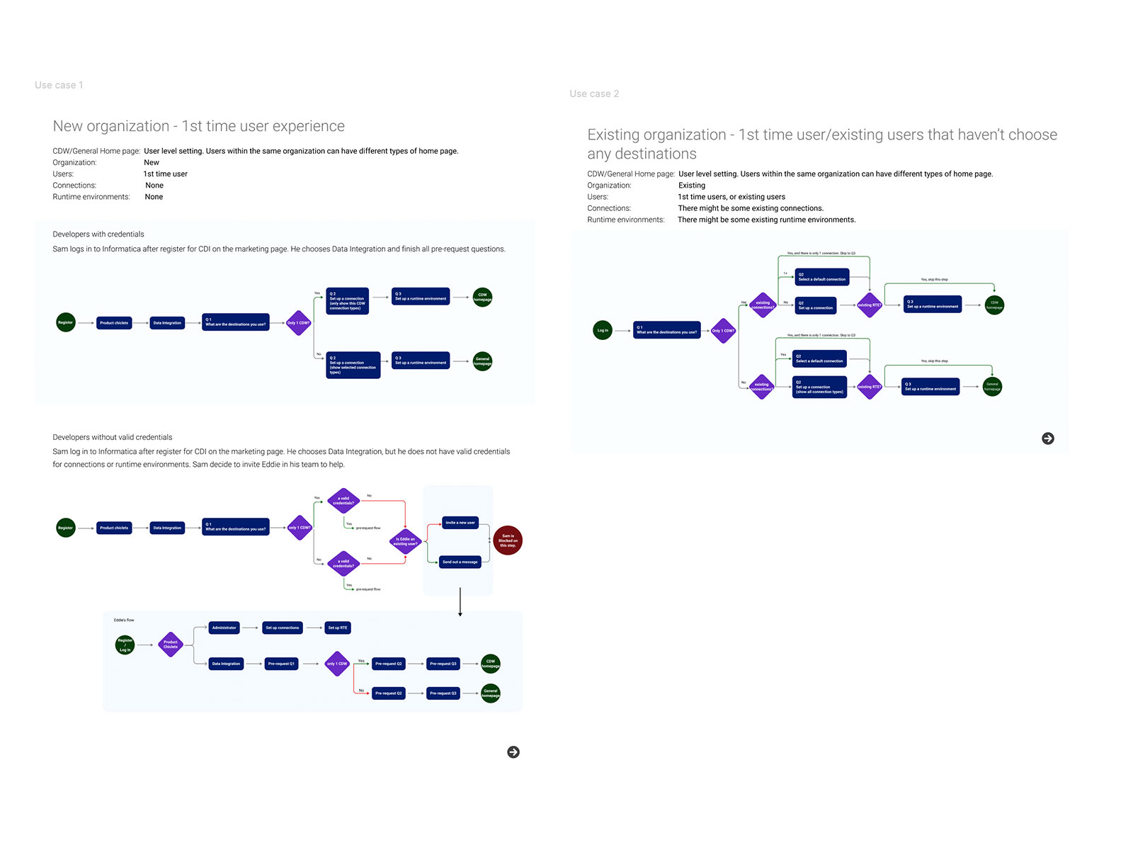
We collaborated with product and engineering stakeholders to define core use cases based on real onboarding paths. These included first-time users from new and existing organizations, each with varying levels of credentials, connections, and environments.
Each user type presented unique decision-making friction. We synthesized this into a series of opportunity statements and guiding UX principles: simplify onboarding, minimize dependencies, and surface guidance contextually.
From there, we moved into sketching dashboards and rethinking entry flows. Key ideas: visualizing transfer types up front, surfacing “Jobs in Progress,” and introducing usage and validation metrics in a clean, visual format.
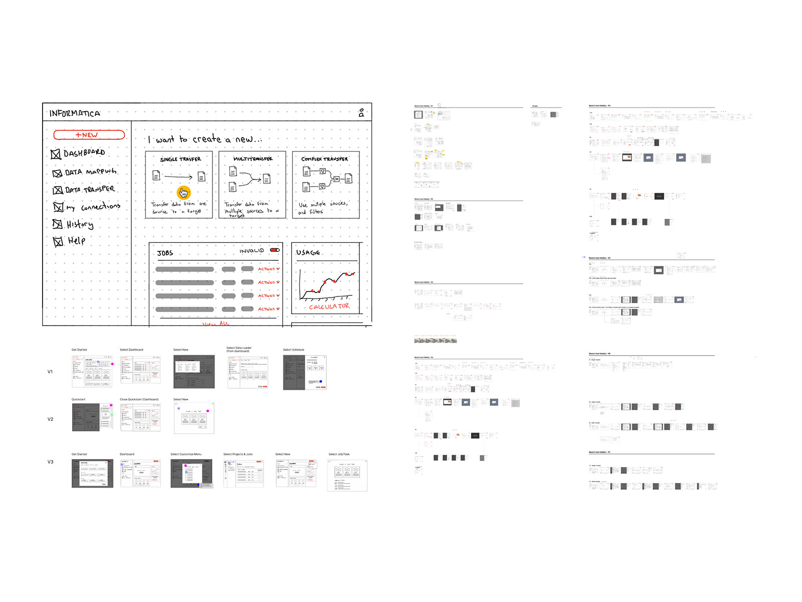
We explored multiple design variations, testing different onboarding strategies and dashboard structures in low- and mid-fidelity. Our focus: modularity, intuitive step progression, and clear visual hierarchy—especially for new users.
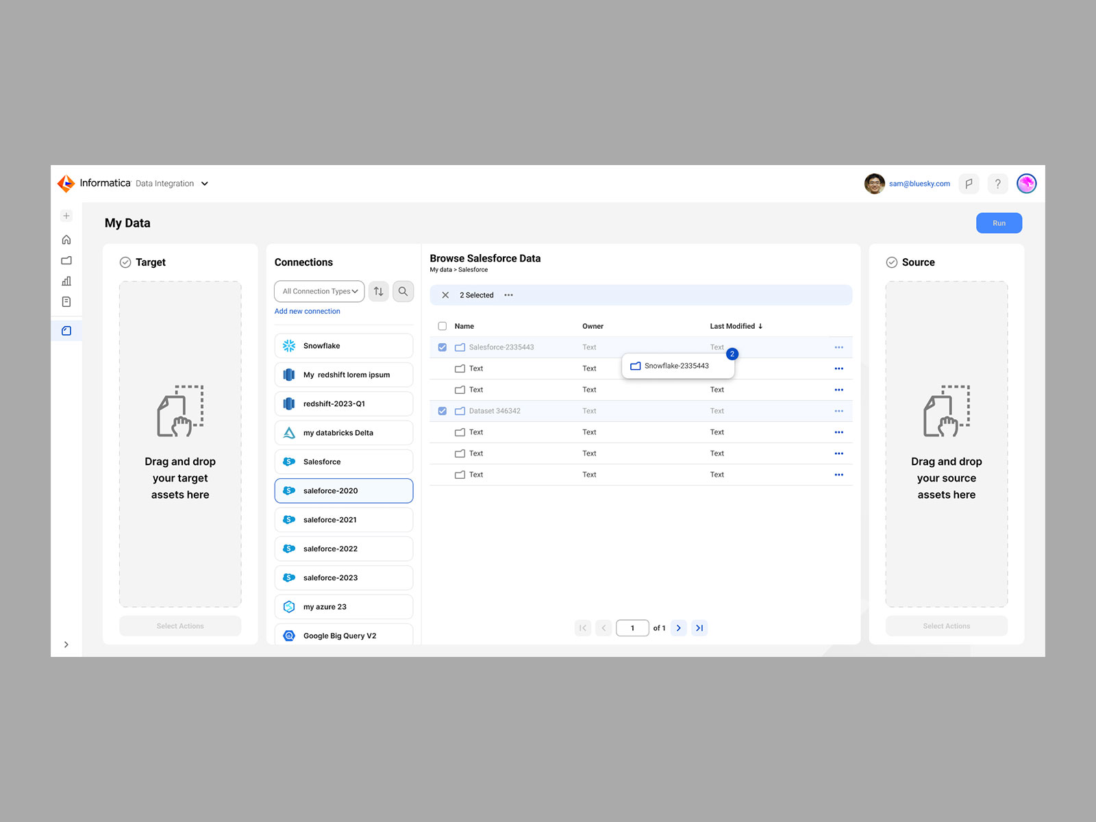

We finalized a clickable prototype built in Figma that combined modern UI patterns with real data logic. The final Data Loader flow was linear, focused, and clean—guiding the user from source to target to run, with contextual actions along the way.
This project was a masterclass in designing for complexity while championing user empathy. It required deep discovery work, strategic collaboration, and translating abstract data logic into actionable, intuitive design. I’m especially proud of how we shifted focus from legacy workflows to new user onboarding—lowering the barrier to entry while preserving room for power user growth. Presenting the prototype at the Informatica Conference and seeing real momentum spark from our work was a career highlight. This project reflects my strength in systems thinking, stakeholder facilitation, and designing forward-thinking solutions that align product vision with real-world usability.

Financial Risk Management Dashboard (Confidential)

Learn Share