Causeway Capital needed to transform Risk Lens—a raw, spreadsheet-based investment analysis tool—into a modern, intuitive digital platform. The original system relied on manual data integrations, complex APIs, and lacked any UI layer, making it difficult for investment managers to use and nearly impossible to scale or share. Our goal was to reimagine Risk Lens as a fully web-based portal that would deliver granular insights, seamless workflows, and brand consistency across the experience.
I led the product design from concept to handoff, owning the full UX/UI lifecycle for the platform.
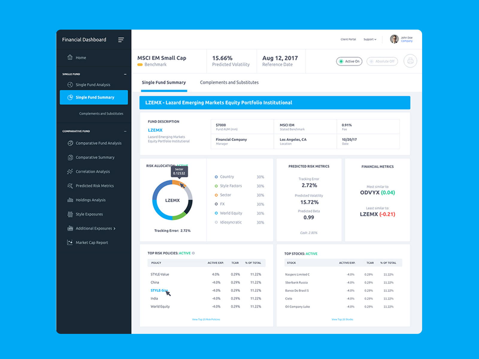
Risk Lens started as a powerful but inaccessible internal tool. Investment managers had access to rich analytics but relied on spreadsheets, ad hoc integrations, and technical guidance to get insights. There was no visual interface, no streamlined process, and no scalable way to share fund performance data with clients.
Key issues included:
To design a fully digital, user-friendly analytics platform for investment managers that:
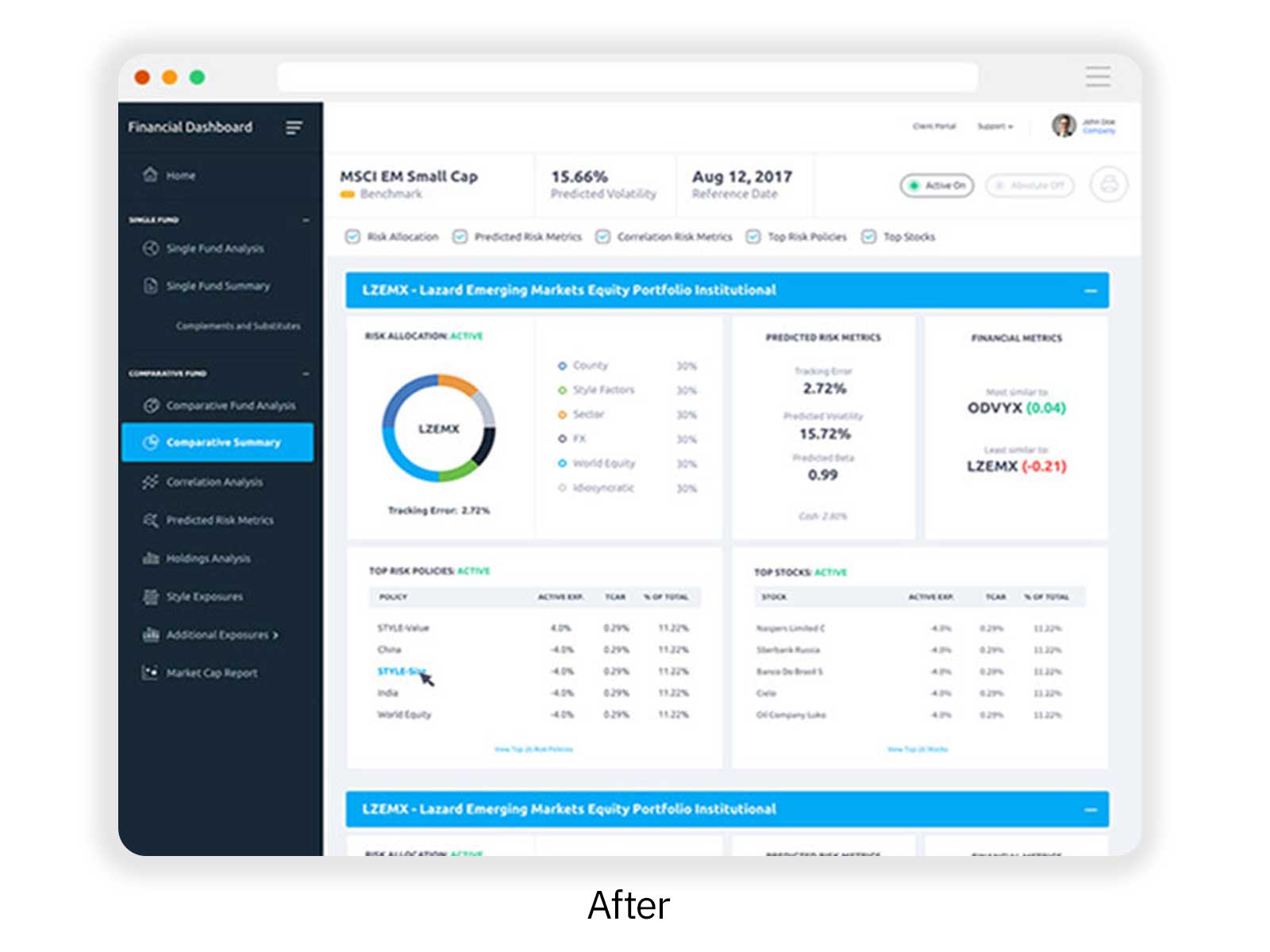
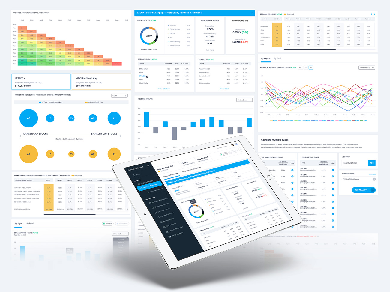
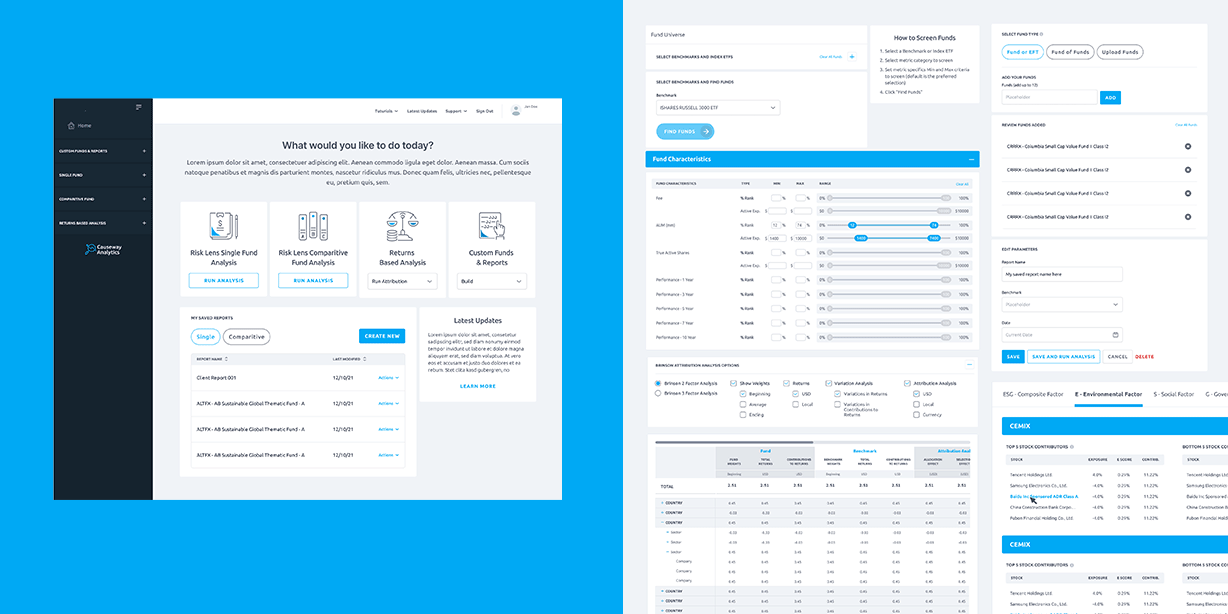
We rebuilt Risk Lens as a modular web-based platform from the ground up. This included:
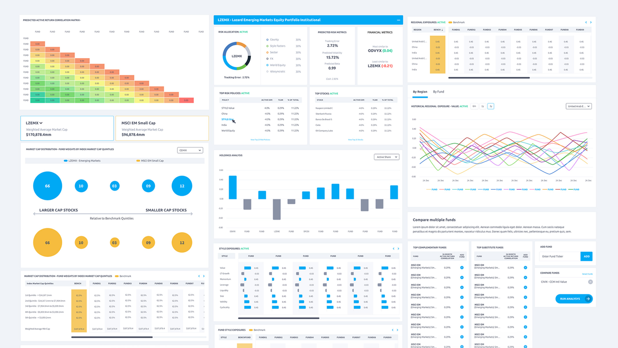
The redesigned Risk Lens became a powerful internal tool for investment managers to drive smarter decisions and client conversations. It:
Today, the platform is live at: analytics.causewaycap.com
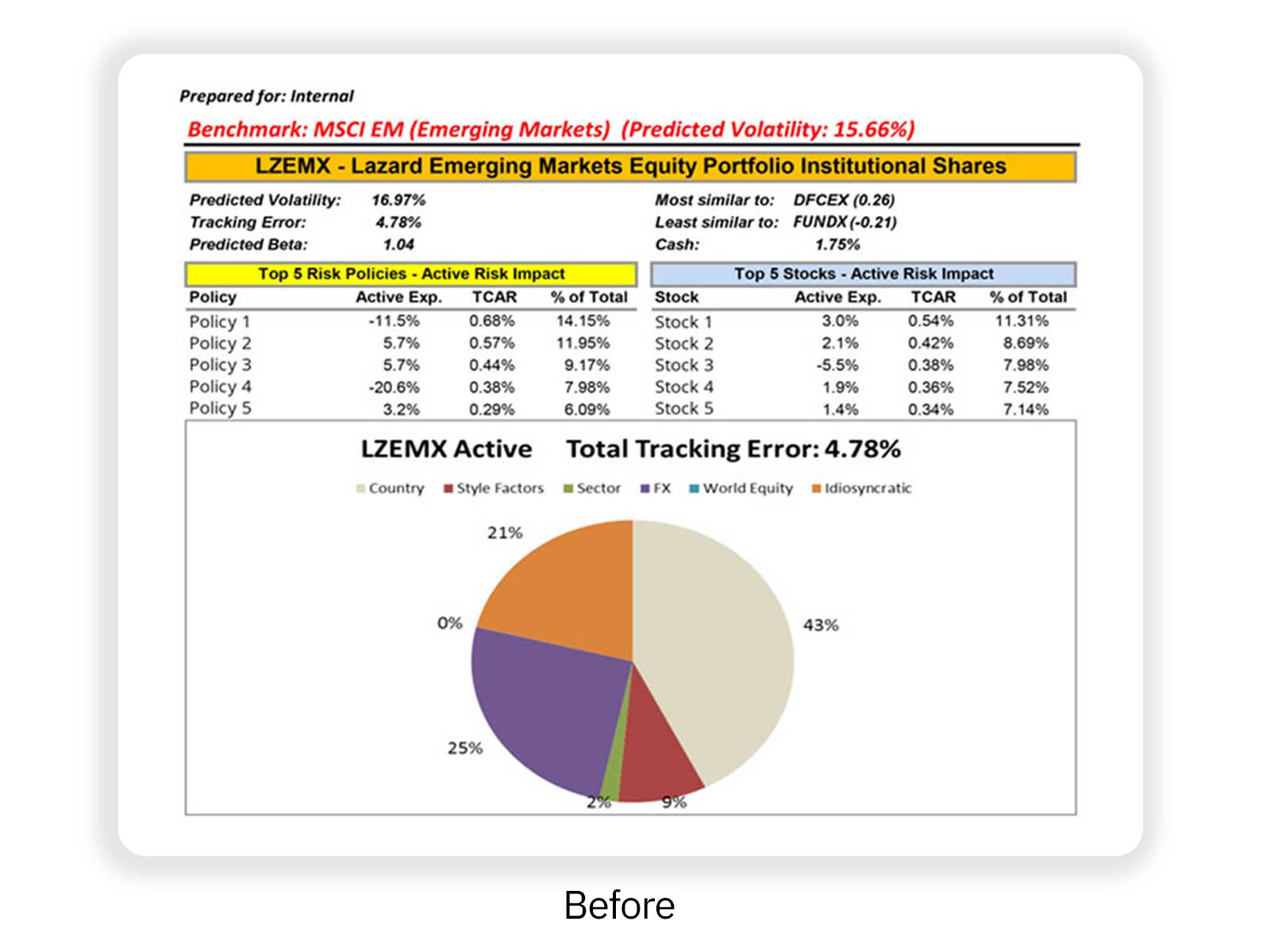
We began by analyzing the original spreadsheet-driven process alongside product management. I reviewed existing outputs and interviewed stakeholders to identify the most common workflows, pain points, and performance bottlenecks. The lack of interface meant designing from zero—but it also opened the door to rethinking how managers wanted to view, compare, and explain fund data.
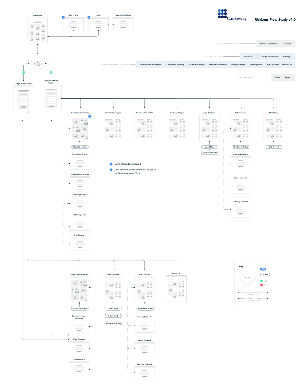
From discovery, I defined task-based user flows, focusing on key analysis types: Single Fund views, Multi-Fund Comparisons, and Historical Risk Overlays. The priority was clarity—users needed to know exactly where they were in the process and what action came next. I created annotated wireframes to establish baseline layouts and task groupings.
In the concept phase, I explored data visualization approaches that balanced flexibility with readability. We tested various layouts for fund selection, time period comparison, and asset-level analysis—paying close attention to how much data could be shown without overwhelming users. These informed the first round of clickable prototypes.

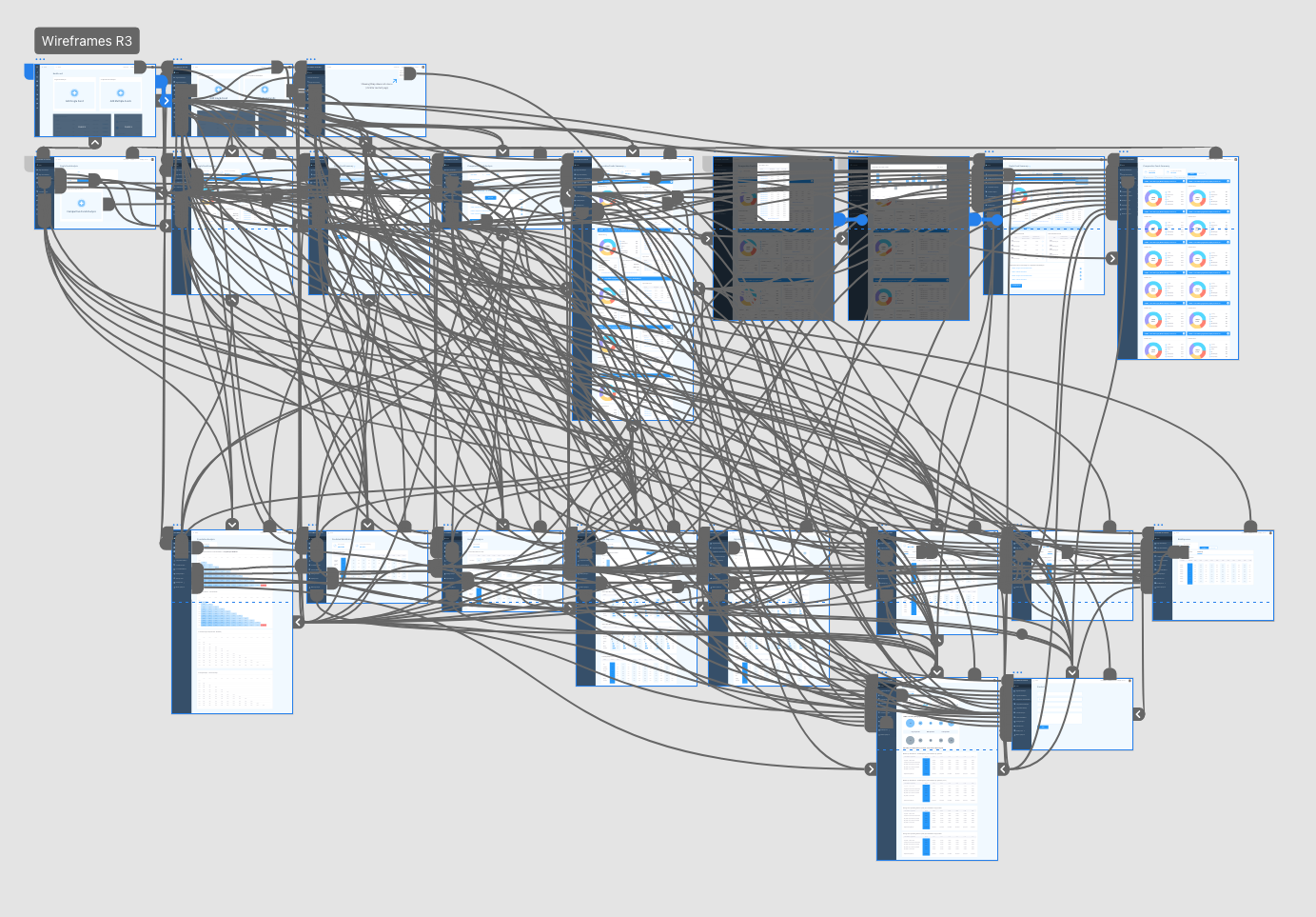
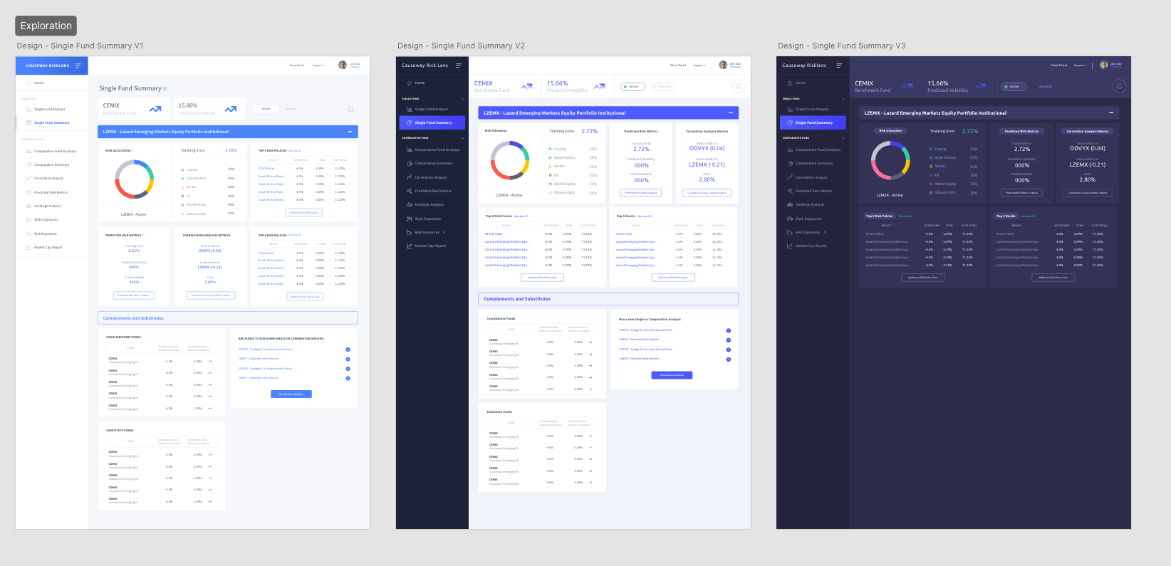
With working prototypes in place, I iterated based on feedback from product and internal users. I introduced modular card components, refined chart labeling and legends, and simplified fund navigation to reduce clicks. I also ensured visual consistency across light and dark themes, considering different investor environments.

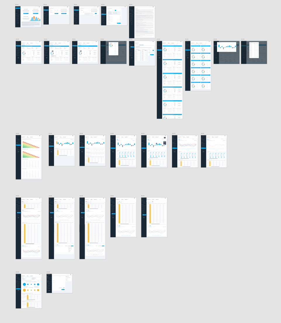
To future-proof the platform, I built a custom component system aligned to Causeway’s branding. Every button, chart style, input field, and tooltip was created with reusability in mind, enabling future product teams to expand Risk Lens or integrate it into other analytics tools.


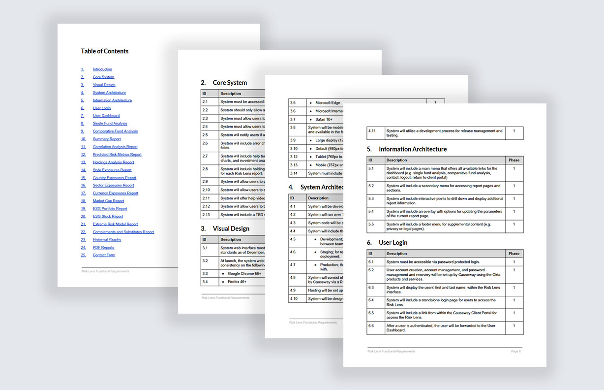
I packaged all final UI designs, style guides, and redlines for engineering, working closely with devs to ensure successful translation into code. We completed QA support and reviewed interactions together to maintain fidelity through launch.
The result was a sleek, functional platform that empowered investment managers and elevated Causeway’s digital capabilities.
This project reflects my ability to translate complex financial data into user-friendly systems. Designing Risk Lens end-to-end—from UX strategy to pixel-level UI—was a rewarding challenge that blended technical design, brand thinking, and user empathy. What began as a raw internal tool is now a core part of Causeway’s investment workflow, supporting advisors and their clients with clarity, confidence, and strategic insight. It’s a great example of the type of transformation I lead: from crude systems to seamless experiences.


Informatica Next Gen Data Loader
3M B2B Service Automation Portal